Logos are epic. Those powerful symbols of personality, everywhere.
If you are looking at creating a logo for your company, or in need of an update, there are a few basics you should know.
As I was given this opportunity to write a post on logo design, I immediately thought of how much of my work here at Flint is spent designing, shaping, updating, curating and dissecting logos until they become “something.” And by something, I mean that perfect symbol that evokes a feeling and a message and is memorable. Not an easy task. So, I thought I’d show and tell a bit of how we do it. It’s a process our designers are very good at, and it’s often a favorite part of our job. Here’s why:
Logo design is a craft
As logo creators, we know how critically important company identities can be; logos are often the first visual representation of the company’s story, and they play a significant role in a company’s marketing puzzle. Possibly, the designer’s ultimate challenge. Designers and some visually imaginative folks can look at a logo and see paragraphs worth of meaning – each curve and nuance having a dramatic effect on the feeling and usefulness of the mark. Most are aware of this end product – that mastery of type, shape, emotion, medium and individuality – but few are familiar with what it takes to get there.
Logo creation is not science-y
There is no algorithm to create the perfect logo. Logos created that way look like other logos; they do not look like your company.
Research. Research. Research.
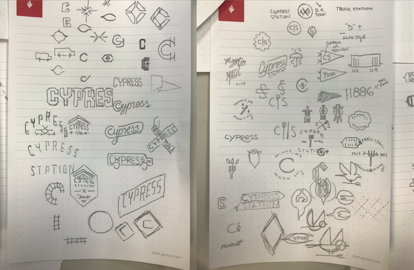
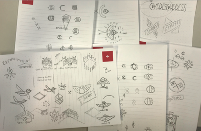
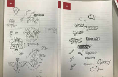
It’s best to do your homework. Logos work on many levels, and finding the balance of what you want to say and what you don’t is tedious. Sometimes those stories are obvious, and others are aha moments. It’s amazing what visual truths can be uncovered, or ideas sparked by moments in history. Most designers will tell you, the refinement of all that information is learned by many successes and failures, but ultimately a lot of practice. How does this happen? We bury our heads in sketches and shapes and wrong turns ad infinitum until the unicorn raises its head and winks at you.
A client recently told me I knew more history about their hometown than they did. And you know those great designers I mentioned earlier? They never hesitate to lend straightforward, “you might want to sit down for this” advice. We’re amazingly cross-disciplined. The conversation doesn’t just exist among our creative team. Research is sought from everyone here because they never hesitate to spend 20 minutes discussing a “not my client” solution, because they care.
When I developed the Workhorse logo below, I needed knowledge about farm life. I could search some of this out, but was fortunate to be able to cherry-pick individuals who have lived it. And what’s better than a real conversation about real life experience with a real human being? I asked Michael Swanson, web developer and former ag teacher, about his life growing up in rural Chili, Wisconsin. We discussed symbolism, horses and lifestyle. He imaginatively explained in detail what it was like there. I got valuable creative information in a short amount of time for my client, and I got to know more about Michael. Win-win.
Three different directions
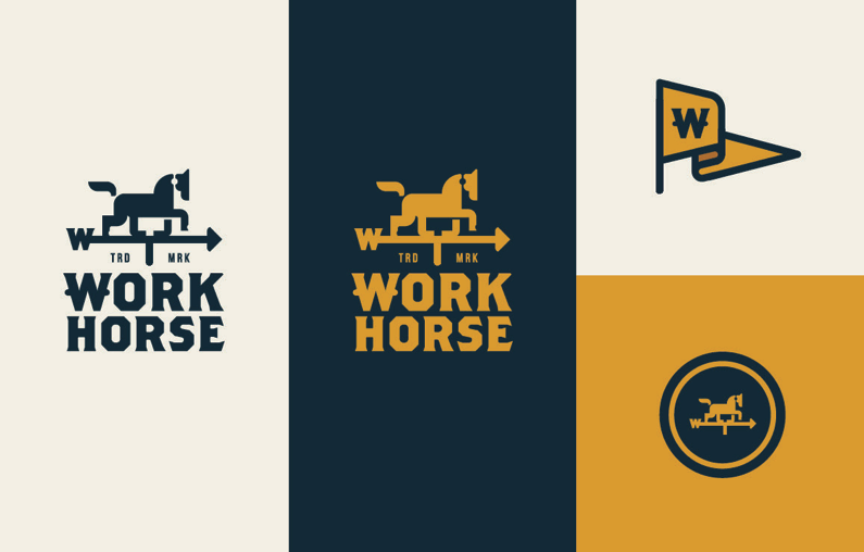
By investing up front in your identity, you build momentum in your brand. With our Workhorse client, we tried three distinctly different directions. Which would you choose?
Workhorse logo option 1
This logo combines two symbols synonymous with farming – the Belgian horse and weather vane. The weather vane is a symbol of direction and is seated at the highest point of a building. The horse is a historic symbol of strength and beauty. Together, they point farm owners and farm laborers in the right direction.
Workhorse logo option 2
This logo uses a stencil font, which is a common, handmade type found on farms. You will also find a smartly placed horse’s head in the negative space between the K and H. Together, this creative, do-it-yourself approach speaks to visitors with good old-fashioned smarts and hard work.

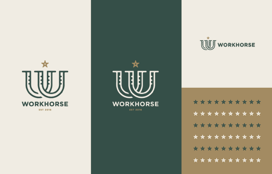
Workhorse logo option 3
This logo combines two horseshoes to form the W for Workhorse. This symbolizes the unity and strength of farm owners and farm laborers in that without one, the other does not succeed. The W is accented with a star/spur, standing for quality, leadership and a higher standard.
The results are three distinguishable logos, each representing a unique quality for the company. Which did they choose? The client chose option 1 for the directional presence their site provided.
Crafting the perfect food truck venue identity
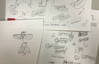
Another logo project is our work for Cypress Station, a food truck venue housing 15 food trucks with a fusion of food choices. They bring you great food but also serve as the local cheerleader for the city. Our work here channeled our inner foodie. When asked if I could show my sketches, I uttered a reluctant “Yes?”. They are not pretty – a channeled chaos, perhaps. Part of the logo process is letting loose and drifting.
The results are brought to life in colorful and bold shapes and text, each with their own history and meaning.
Cypress Station logo option 1
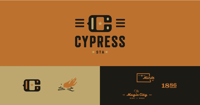
This logo was inspired by two ideas – a university-style monogram and railcars of the 20th century. Together, these build on the nostalgia and strength of a college-style mark, while embracing the hub or meeting-place nature of Cypress Station.
Cypress Station logo option 2

This logo is a celebration of coming together under one roof to enjoy quality culinary experiences in the town we love. The mirroring represents more than one side, and the banner is flanked by a star and a twinkle of magic – as Minot is known as “The Magic City.”
Cypress Station logo option 3
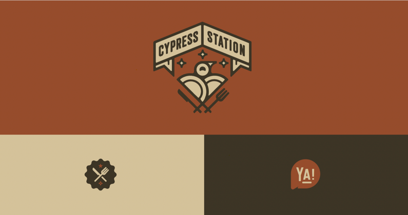
This logo was inspired by Henry D. Minot, an investor and ornithologist (a person who studies birds). We combined numerous items in this mark to unveil its authenticity, fun and somewhat quirky side of the food truck experience. Combined we have a banner, mimicking the roof line of the Station building, a stylized meadowlark, North Dakota’s state bird (who’s holding a fork and knife and whose wings are made of dinner plates), and between them twinkles of magic. The character bird serves as a persona to the brand and happily brings you the best food from around the area.
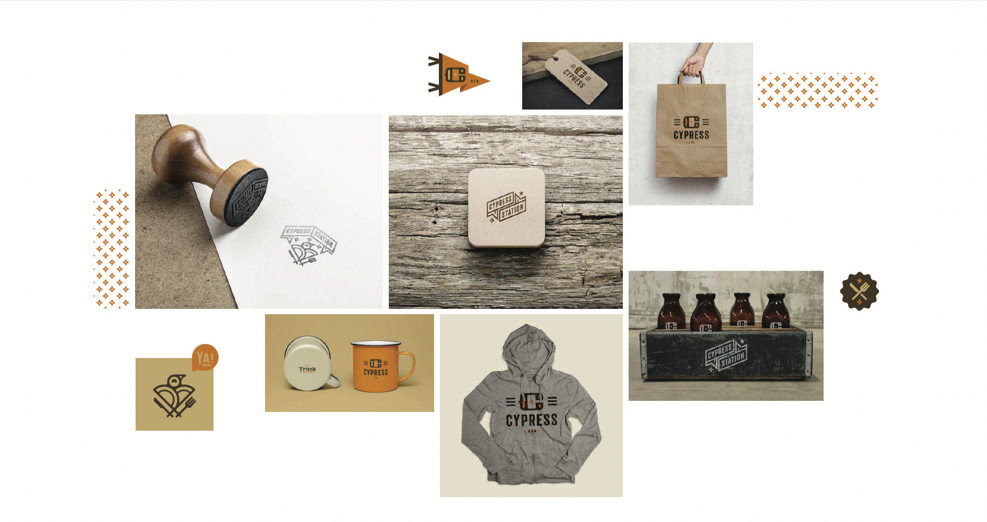
We then go about showing the client what their new logo looks like in the real world.
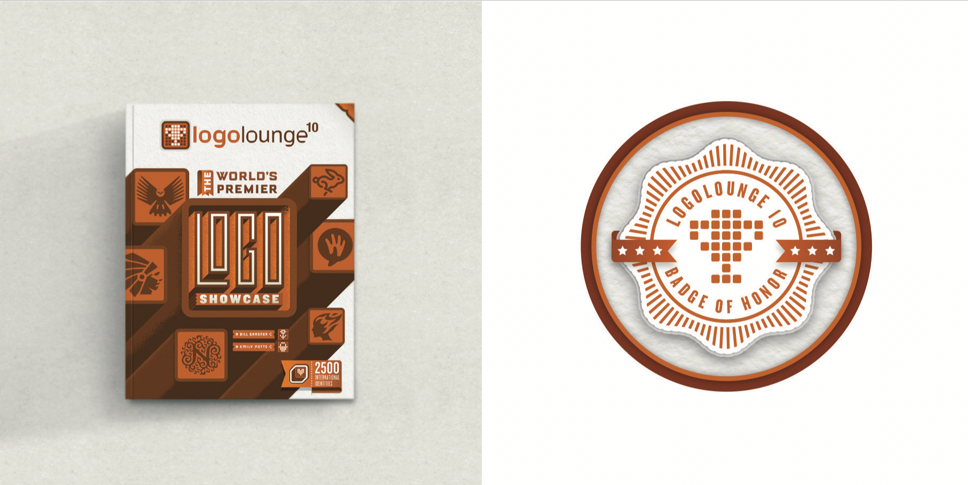
The added bonus to doing your logo homework is your agency gets recognized for its work. We were fortunate enough in this case that all three logos submitted appeared in the recently published LogoLounge Book 10, the world’s premier logo showcase. Means of celebration for a job well done. For more reasons to celebrate, check out our work.